The project
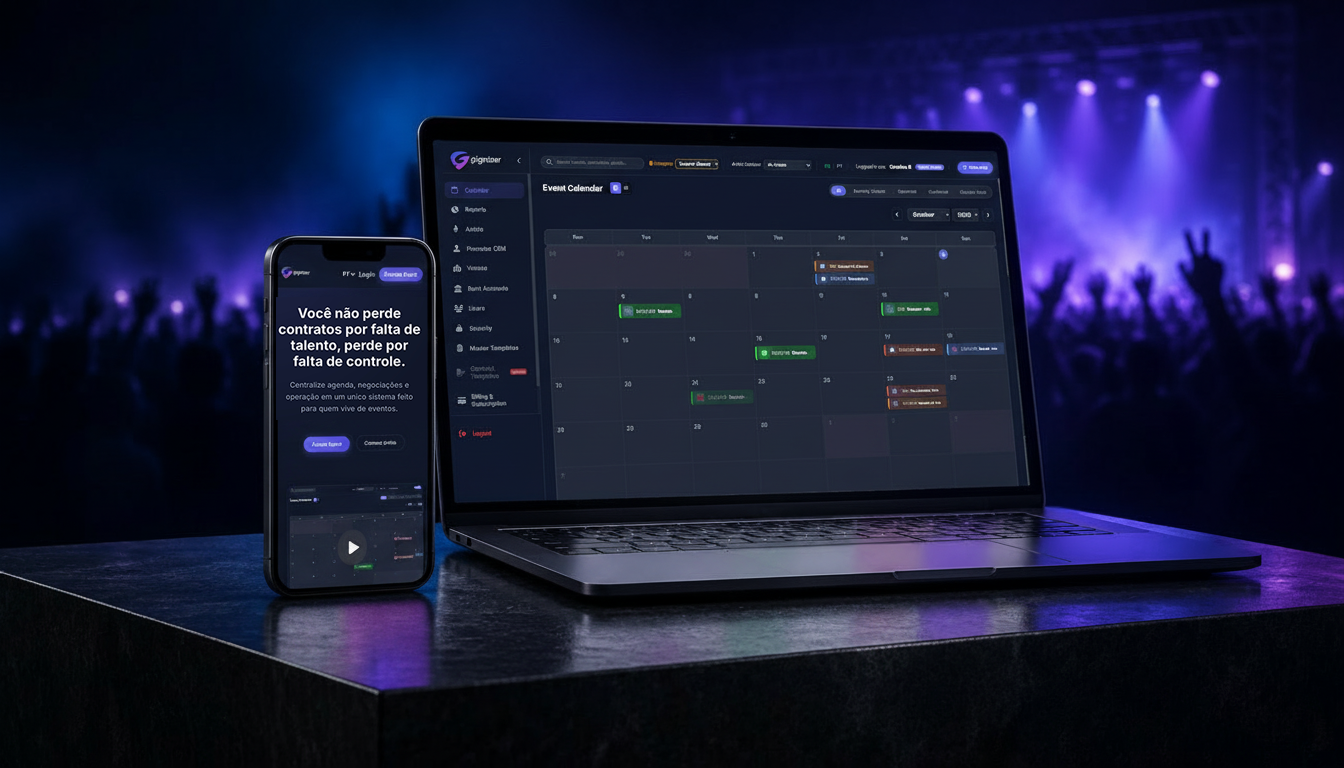
Gignizer is an event-management platform created to help artists and teams manage the business side of live performances, bringing schedules, negotiations, contacts, contracts and financial information into one place.
As co-founder and Visual Designer, I created the brand's visual identity and worked on how it translates across the product, website and communication.
An identity built around movement and energy.
The identity needed to feel contemporary and technological without becoming cold or overly corporate. I wanted to bring some of the energy of live events into the brand while keeping it simple enough to work in different contexts.
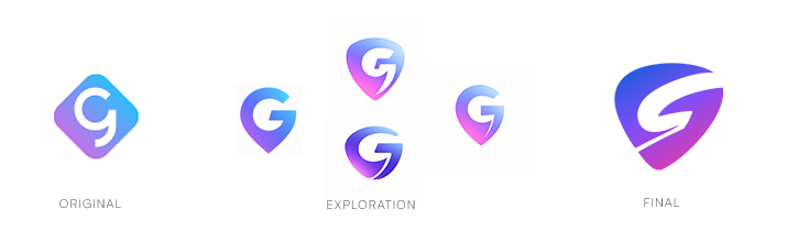
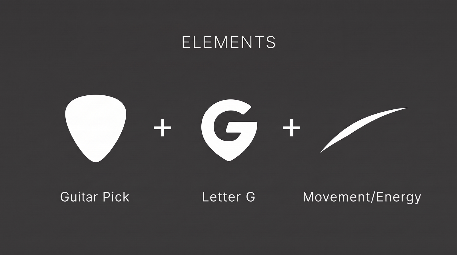
The symbol came from three ideas: the shape of a guitar pick, the letter G and a sense of movement. I explored different ways of combining them before arriving at the final design.
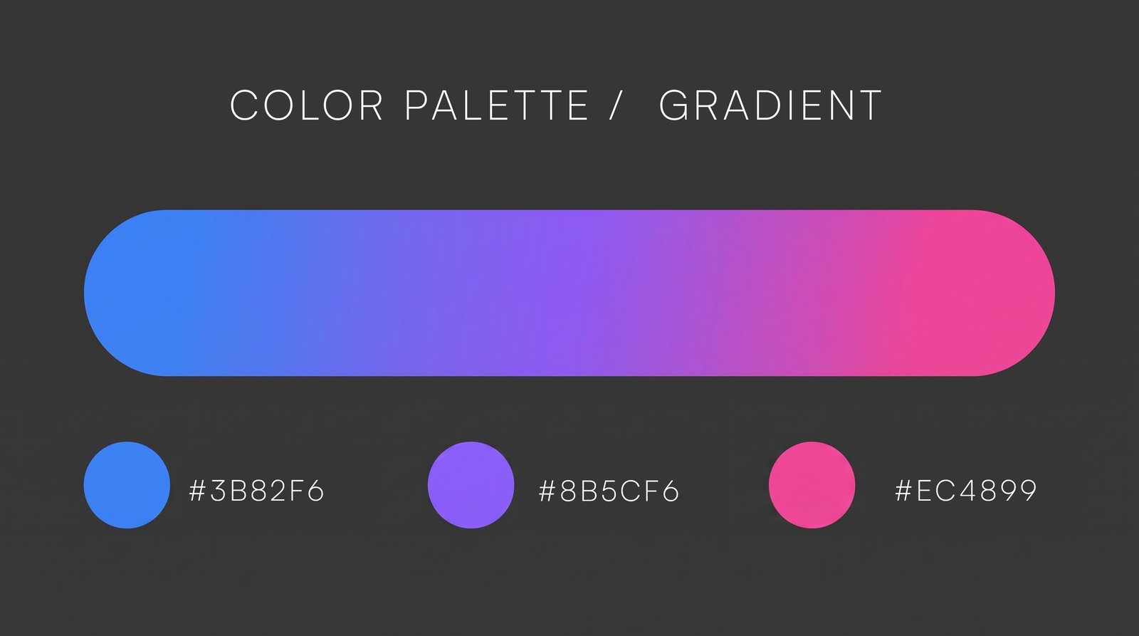
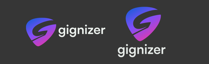
The blue-to-magenta gradient became an important part of the identity, paired with a dark palette that works well across the product, website and digital communication.
From identity to product.
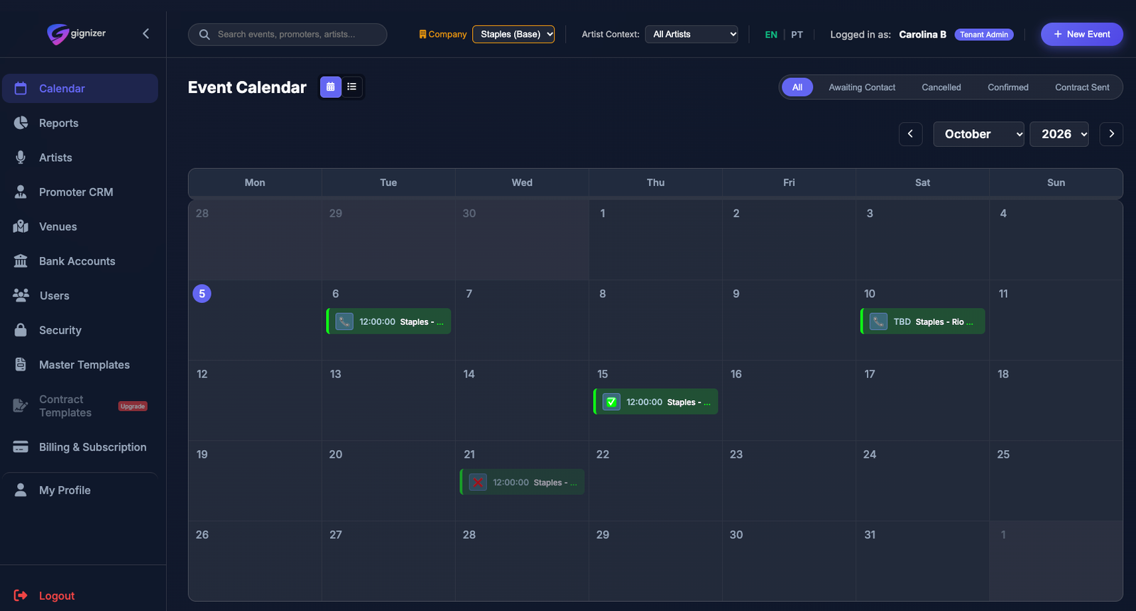
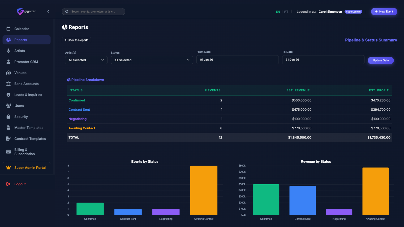
The product deals with a lot of information, so I wanted the visual identity to support usability without competing with the content. I brought the same dark palette, typography and colors into the interface, but used them with more restraint.
Across calendars, reports and data visualization, the goal was to make complex information easier to read and work with.
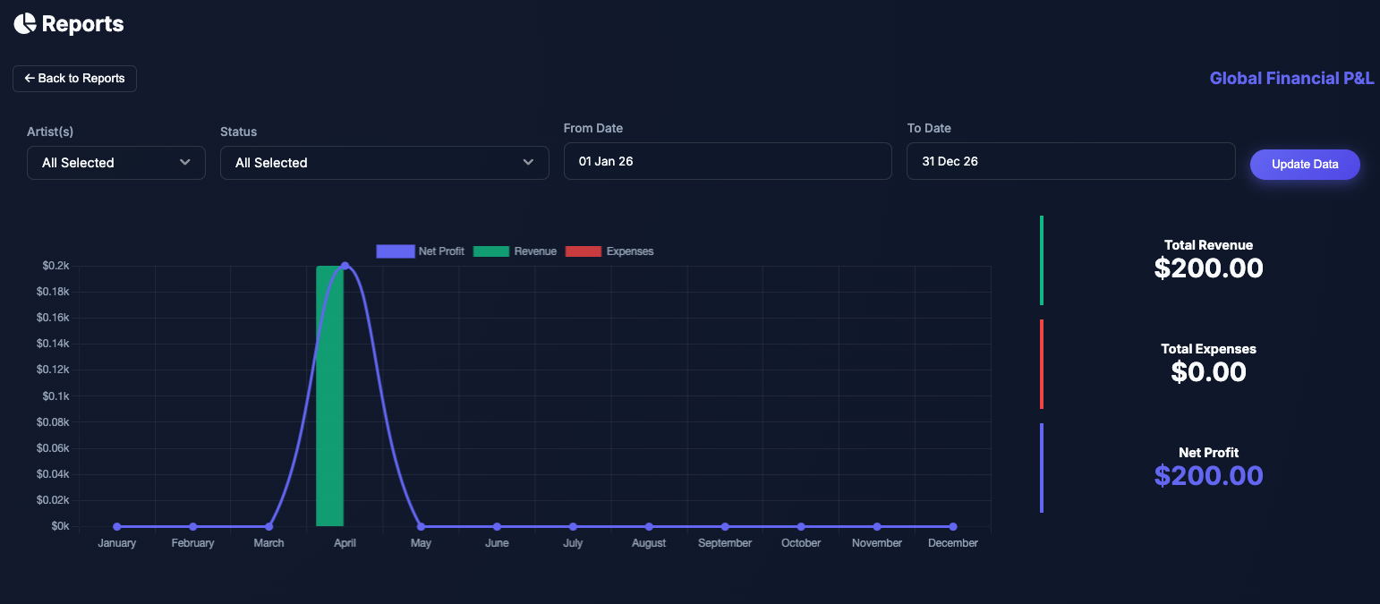
Turning complexity into a clear story.
The website starts with problems that are familiar to anyone managing events, then shows how Gignizer can make that work more organized.
Instead of explaining every feature, I wanted to keep the story simple and connect real problems with what the product actually does.
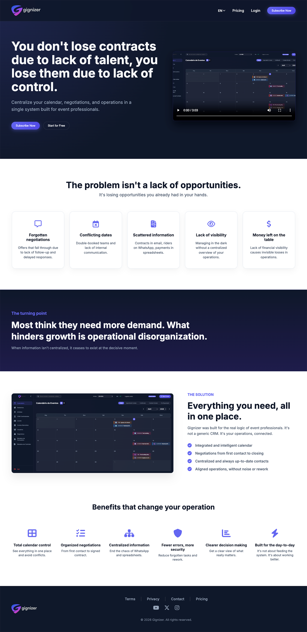
Building recognition through consistency.
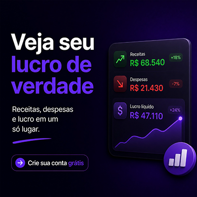
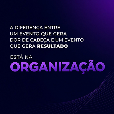
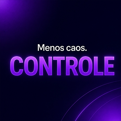
For Gignizer's ongoing communication, I created a set of recurring elements using typography, gradients, product imagery and simple graphic details.
The idea was to make the brand recognizable without making every post look the same.


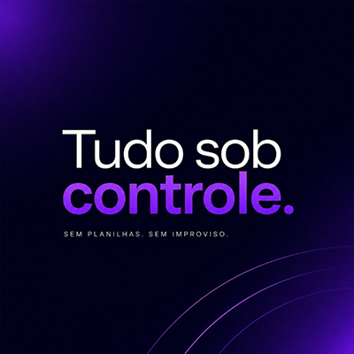
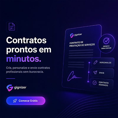

Making the product part of the brand.
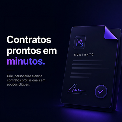
Over time, I started bringing more of the actual product into the communication. Screens, data and workflows became part of the visual material, helping people see what Gignizer actually does instead of only talking about it.
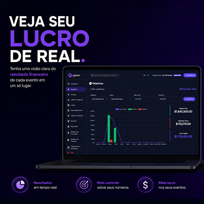
One visual system, many touchpoints.
As Gignizer grows, its identity continues to find new applications across the product, website and communication.
What started with a logo and a few ideas has become part of how the entire platform looks and communicates.
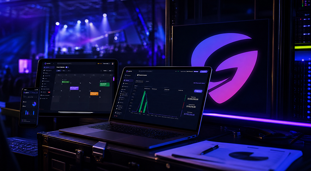 Final Composition
(Brand + Product + Communication)